Viewing entries in
Luxury Real Estate Web Design

Savvy Brand Marketing: Is Your Marketing Remarkable or Ho-Hum?

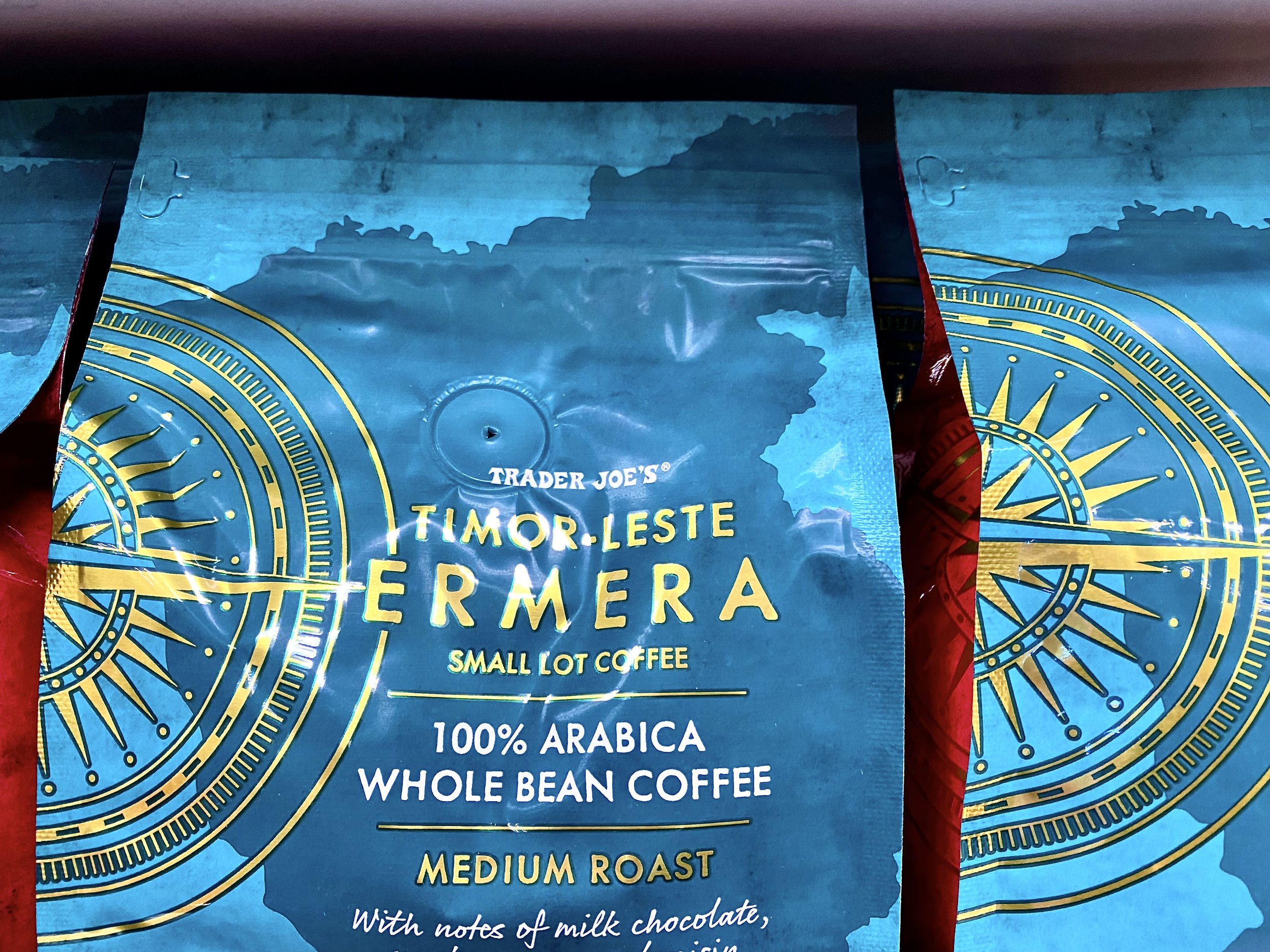
Pictured above is packaging for coffee that I spotted on this Monday morning, while shopping a Trader Joe's. I was impressed by the packaging, the colors and the graphics that went into selling coffee beans. There is nothing ho-hum about this packaging. Note the red color on the side of the bags, as well as the gold lettering!

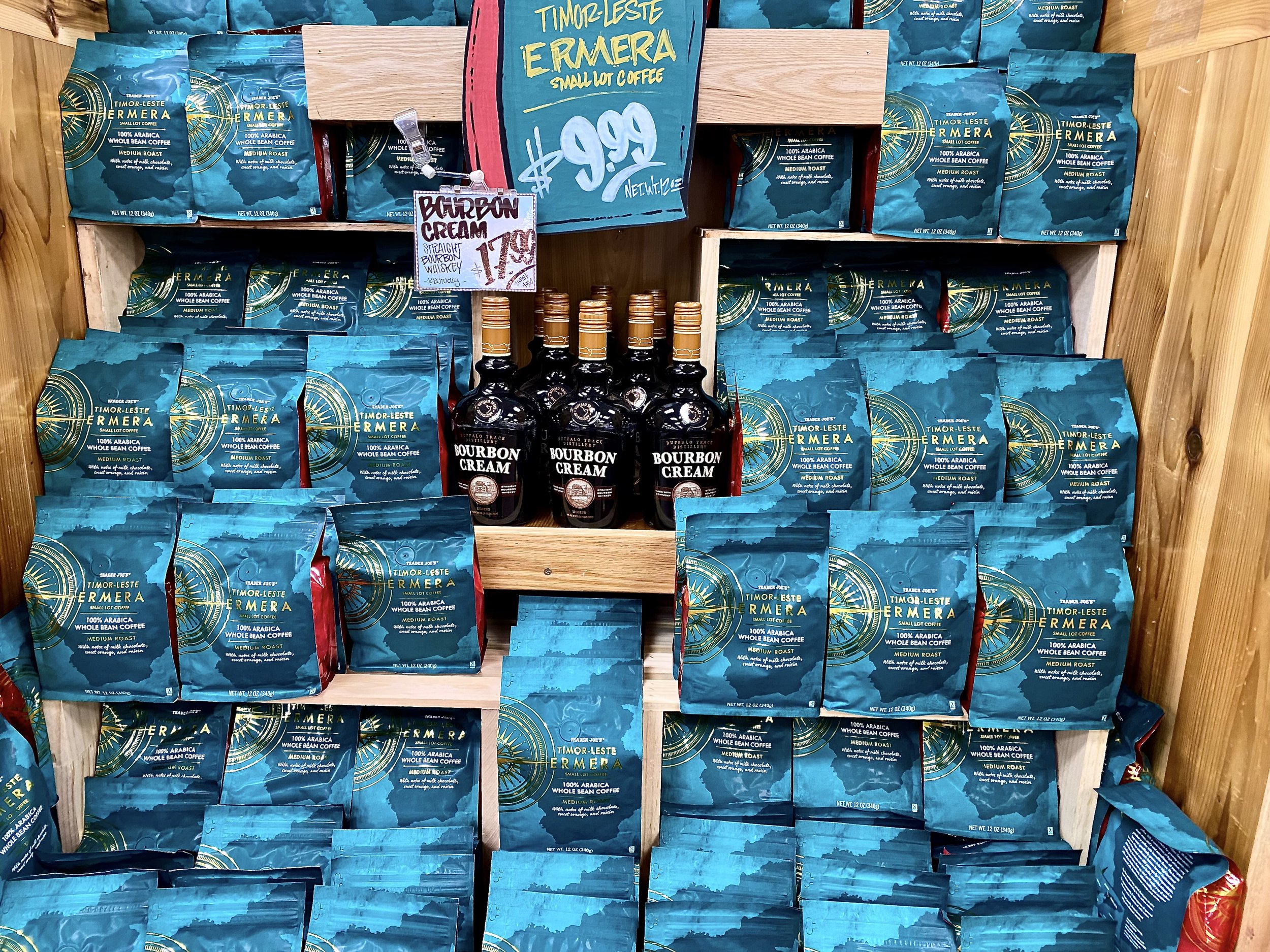
And here is the full display of the vignette they took time to create and build. Given the price of each bag is $9.99, the packaging is worthy of beans priced at $19.99. This may not be your taste in color, however, you cannot deny that it is remarkable!

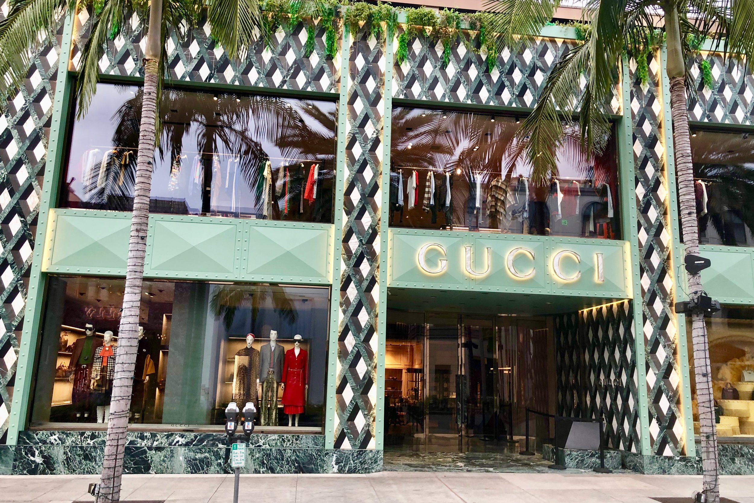
Being at the top of your game as a real estate marketing professional regardless of your niche requires being consistently remarkable.  After all, you are selling one of the largest investments your clients may make in their lives.

Your marketing materials are your silent brand messengers.  This includes your web site, your marketing message, as well as any printed material you share with the public as well as other agents, such as postcards, presentation folder, and handouts at broker opens or open houses. 

These need to stand out and communicate your identity and its congruency with your target market.  And they will communicate to your intended market your savvy in brand marketing!

Are your marketing materials remarkable or ho-hum?

Not So Wordless Wednesday: A Most Unusual Foyer

Here is our route to the parking area of the Constant Winery Home via this most unusual foyer.

Ron is opening the door…

As we walk through, there are wine barrels stacked on both sides of the foyer which is underground. This maintains the right temperature.

And it is dimly lit with this custom made Venetian chandelier! We hope you enjoyed this tour as much as we did...It was a first foyer of this kind for us!

Branding Moment: The Decision Making Process that Lead to a Yes!

In crafting a brand, we are adamant about creating a great impression to the right audience. A first impression is what captures someones attention when looking to buy or list in real estate or in any other profession.  It also applies to products and how we make decisions.  

Decisions are not necessarily made solely consciously,(stats and endorsements) but also unconsciously (the gut feeling).  Quite often if we are smart, we will take that gut feeling and honor it by perhaps delaying the decision or nixing it.  A brand that is well crafted will attract the right person to it. Here is an analysis of a simple buy.

Pictured above is bottle of olive oil from a Turkish producer named Nefiss. This is how it ended up in my pantry. 

I am always interested in learning more, and to that day I had not tasted Turkish olive oil. I usually favor Italian or California olive oil.

I was attracted to it based on the design of the bottle, (attention to details).  

I read the little card attached to it describing the family and their story of the care and age of their olive trees in Turkey, (I like supporting family enterprises).

I was impressed that there was a sample of their balsamic vinegar on the bottle in the same shape as the bottle, (congruity in design and a sign of a generous spirit).

I found it in the take out store of Industrial Eats in Buellton, California.  We both admire the owners who are even more finicky than we are, when it comes to excellent products for their restaurant, and the products they sell...They became a subtle endorser brand.  In other words,  I trusted their judgment. 

Even, if I did not like or use olive oil, I would have bought it for a friend who does, based on my impressions. We all have an abundance of dominant impressions that guide our decision making.  When I ask people what led them to hiring someone, they come up with many of the thoughts I mentioned, and others that govern their decision making.  Quite often, the gut rules, because it is the least biased impression!

Have you ever analyzed your decision making process?

Branding Moment: It took 30 minutes to Understand this Brand!

When we write these posts, it is with the intention to inspire those real estate companies and agents to elevate the look and feel of their website, to make it user friendly and give the client/customer a wonderful experience while browsing your site.  
Once again we were stumped by this brand, and what their slogan meant (pictured above). And below is the brand logo.

It took me 30 minutes to figure this out, and I had to visit several sites to gain  an understanding. Finally, I found their site.  The site's first offerings are Tshirts with their logo and slogans. Below are beer pack of offerings.  

By surfing links, I was able to find their unique reason for existence.  The beer featured on this truck is described as:" Cashmere hops are joined by their juicy tropical aromas of citrus, pineapple and coconut.." It is one of their sub-brands of the Stone beers company.

Bottom line, think of the client's experience, when seeing your website.  Keep it simple, keep it clear and easy, do not make them guess!  Most people would have given up after the first manifestation of their social page...I would have!

Branding Moment: Simple, Subtle and Special--The Wow Factor!

When we write these posts, it is with the intention to inspire those real estate companies and agents to elevate the look and feel of their website, to make it user friendly and give the client/customer a wonderful experience while browsing your site.  

From our point of view that is worth more than all the  search optimization you could pay for. The wow factor results in word of mouth marketing, which is much more powerful and result driven. These are the principles we adhere to in our branding and design work

I really loved this ad Van Cleef & Arpels created for their latest ring, known as Frivole between the fingers ring!  If you look closely, at the mirror polish gold, you can see the reflection of the lady bug!  

Here is the description from their website, where you can see this creation up close; "Like so many flowers dancing in the breeze, the Frivole® creations by Van Cleef & Arpels stand out with their graphic and airy aesthetic. Mirror-polished gold bestows a singular radiance upon heart-shaped petals." 

The ad is simple, subtle and special!  If the reflection of the lady bug in the ring had not been there the ad would not have had that same impression! Details however minute completes the brand's statement of attention to detail.  If you take time to peruse the website, you will notice the ease of navigation, and the clean look and feel of it.  

Real Estate Websites & Curb Appeal Gucci Style: More Than Meets The Eye

As part of our brand strategy services, we design websites to be consistent with the brand and for curb appeal, we do not develop them.  In other words our concern is with the aesthetics of a site  and not the codes needed to make it work. 

As part of our brand strategy services, we design websites to be consistent with the brand and for curb appeal, we do not develop them.  In other words our concern is with the aesthetics of a site  and not the codes needed to make it work. 

This past Tuesday morning, we took time to walk along Beverly Hills famed Rodeo drive to study the latest remodel revealed of the flagship Gucci store (pictured above) which began in May of 2018. 

We focused on studying the design. The extensive use of marble combined with a green metal for the brand name and support emphasized the longevity of this luxury brand (founded in1921, in Florence) as well as it new progressive era combining it with metal as part of the design.  

The marble is cut in pieces in "trompe l'oeil," style, and precisely placed in a geometric pattern to create the 3D illusion. This translates from French as optical illusion or something that fools the eye.  To the touch the surface is flat.

The entry way to the store is a curved wall of trompe l'oeil inviting you into the store.  The other side of the entry is a curved glass wall giving you a peek of their merchandise.  It gives the shopper a feeling that there is more than meets the eye, a sense of surprise and excitement, wanting to see more, (pictured below).

Does your website have curb appeal?

Luxury Marketing Essentials: Maximizing Your Website's Power of Attraction!

As a luxury or any category of real estate marketing professional, one of the best ways to think of your real estate web design is to study the window dressing of   fine retail establishments.  A luxury retail store is designed to attract its customers and maximize sales. 

Pictured above is one of the Hermes windows displays in Beverly Hills.  The theme is planning summer vacations suggesting a tropical destination.  Only two items are displayed: comfortable shoes and a large bag for those last-minute items.  There is no clutter, no extraneous items which adds to the power of attraction.

Here are some guidelines to consider that are applicable to web design:

  • The store front usually has a huge window display. The idea is to let customers see the merchandise within the store, as well as a special vignette of the latest merchandise. On the web site this should be your home page. Is it appealing to look at? Does it have curb appeal? As part of the home page, several iconic images of the area in which you work may be appropriate.

  • Is the merchandise aesthetically pleasing? When looking at what you are displaying, i.e. your listings, how do they look on the page? Are the initial photos inviting the potential client to click further and find out more? Is there logic to the way they are displayed?

  • When you are in the store are the colors complimenting the displays? Is the site easy to read? Often black is overused as a luxury color particularly with white lettering. If the whole site is black with white writing, it is hard to read. It may be beautiful from a design standpoint, but difficult on the eyes. Is the type large enough?  Functionality is more important than the look. The purpose of the site is to attract clients, not to win awards.

  • Is it easy to access the inventory? Is the search function easy to use on your site? If the client has to fill out a lengthy form to find information, they will click away. There are plenty of sites on the World Wide Web that can be searched by remaining anonymous. Is it easy to access you?

  • A luxury store avoids clutter and anything that may detract from focusing on the merchandise for sale. Avoid all extraneous information. Accessorize with pertinent and insightful information about your marketplace such as the nature of your community and why it is special.

In conclusion, think in terms of attracting the customer with eye candy.  Keep them interested in your listings.  And do not forget to refresh the site with new photos and new displays of your listings and community.

Blurring Branding: A Case of Monkey See Monkey Do Branding!

If your aim in luxury real estate or any other branch of real estate is to have the majority of the market share in a niche or specialty, it is important that your brand is hard to blur, in other words hard to imitate. The logo and design should be original in order to prevent someone from copying your brand or colors making slight changes.  Blurring in legalese is known as “trademark dilution”.  The intent is to confuse the consumer into buying your brand, because it is similar to something that is already familiar.  A big firm whose logo has been blurred has the funds to sue and prove that the blurring party is affecting their business and profitability. 

Pictured above is a perfect example of blurring in tuna.  We have been partial to the Genova Brand of tuna for many years. As we passed the supermarket tuna aisle we noticed that Bumble Bee had rebranded. Prior to discovering Genova, we bought Bumble Bee exclusively.  You can see the original can on their website using a blue and white label, the one we were accustomed to.  For someone in a hurry, it would be easy to pick up the new Bumble Bee rather than the Genova, especially since they share shelf space with Genova, and vice versa those wanting Bumble Bee may find the wrong brand in their bag when they get home.   

 Prior to starting our own commercial real estate firm in Los Angeles, we were wooed with a deal we could not refuse by a new company located minutes from our home in Brentwood on the Westside.  The broker owner had branded his commercial real estate company as Citi-Pacific.  He had spent large sums of money on the logo, video, signs, stationary cards, etc. It was intended by his branding company to give him as a new company a perception of legacy. Six months later, he received a nice cease and desist letter from Citi Bank’s law firm. They own the word “citi”. However, they were also willing to reimburse the costs (by providing invoices) he had incurred in branding.   He had to change the spelling to “city”.  

 Recently, a web developer contacted us to ask us to send him business both as a developer and designer. He sent us his recent work for a real estate company/agent.  It was clear that the template he used was one we had seen, over and over again.  It was a case of fill in the blanks: new agent photo, new location photo (sometimes using the same photo) for another agent in the area.  We have seen that same site in the same marketplace done in different colors, and in some cases the same copy.  We push both our graphic designer and our web developer to come up with something new and different, every time.

If you are tempted to blur to save money, don’t!  Someone may send you a cease and desist letter especially if they have the means to do so.  Blurring is a slippery slope.  Eventually even if they do not sue, they will point out that you have monkey see, monkey do branding.  In the case of Bumble Bee, it lowered our previous high esteem of the brand.  

If you are tempted to blur to save money, don’t!  Someone may send you a cease and desist letter especially if they have the means to do so.  Blurring is a slippery slope.  Eventually even if they do not sue, they will point out that you have monkey see, monkey do branding.  In the case of Bumble Bee, it lowered our previous high esteem of the brand.  

Knowing Your Marketplace And The Mindset of Your Ideal Clients Can Assure Your Success

If you want to have a successful luxury or other real estate practice, you must understand the mindset of your ideal clients and the intricacies of your marketplace that make them happy to live there.  When you take the time to really understand what they need and assure them that you can deliver the results they are after, you become the answer to their prayers.  Here is an example:

Recently, we visited Deer Valley, Utah with friends.  We went to The Market in Park City to stock up on provisions to munch on while watching the NBA Finals. We discovered a section devoted to exclusively to artisanal cheeses.  I (A) asked the cheese monger, Marcy, what was new and exciting? After taking the time to understand our tastes and preferences, she knew we were all fond of cheese and eager to learn.

Marcy proceeded to tell us about her favorites that she was sure we would love too. One of them pictured above was an alpine blossom covered rind cheese made in Austria with milk from 15 brown Swiss cows in each herd.  They feed in the pasture of the Alps.  As the cheese ages, the rind is washed and is covered with the dried edible flowers and herbs from the surrounding Alpine Meadows.  You eat the cheese topped with a bit of flowers along with the rind. We all agreed that this was one of the best cheeses we ever tasted.  

Marcy also went out of her way tell us which crackers to buy and which went with each cheese for the 5 varieties we bought.  Then, as we were walking in the aisles, she ran over to tell us that we should buy a Rosé or a Riesling wine, to pair with our cheese selection.  

We loved her enthusiasm, her expertise and her extraordinary service. Naturally, we followed her advice in selecting wines. Marcy was the answer to our prayers. While out of town we look for experiences that are like touchstones to recall and share with others. It is only natural to refer our readers to her cheese department at The Market in Park City.

Branding Moments: What Is Your Brand Story?

A few weeks ago, we spotted a “new” to us 85% dark chocolate.  The brand’s name is MilkBoy.  The brand and logo did not particularly resonate with us, however what made us buy a bar was the Swiss lineage.  We know how proud and precise the Swiss are when it comes to the art of making chocolate.  We were not disappointed, and would highly recommend this chocolate to any chocolate lover.

We researched the story behind the brand.  The unique value proposition for this brand is that they use milk that comes from the Swiss Alpine meadows.  There is a story here that is part of the brand, with which we were not familiar.

Every spring, the dairy farmers who live in the Swiss Alpine foothills leave their villages and move to the mountains. Prior to their journey, there is a celebratory send-off. Here is an excerpt from the wrapper and the website.

“The young boys and girls wear local costume and accompany the procession as it leaves the village. Some of the boys carry carved milk pails, like the boy of the MilkBoy logo. Once on the Alps, the cows eat their fill of juicy green grass until the onset of autumn, when the farmers descend to their villages.”

Their return is also a cause for celebration.  This story is charming and enchanting and further sold us on the brand.  Click on the website link to hear Swiss cowbells as the cows begin their journey to their spring and summer home.

What Is Your Brand Story?

Brand Colors: How We Select Colors

Our prospective clients often ask us about color selection.  In some instances they like their existing colors, so we update it, or add a bit of contrast with a line or two under their logo, to get the logo to stand out.  Usually, we go through two separate questionnaires to determine the best colors for that logo.  These questions are focused on personal preferences and the theme or mood they want to reflect to their marketplace. 

We talk about their marketplace, and as Ron and I are touring the area we focus on the natural elements in that marketplace.  We take pictures of their environments as a reference. Sometimes, the light of the area is a clue.  If you have traveled to the Southern regions of Italy, you may have noticed that the light has rosy overtones, whereas in France’s Provence region, the light has a yellow tone.   Based on our studies, we prepare color palettes for them to review.  These color palettes are harmonious as well as contrasting.

The photo above was taken in Juneau, Alaska near the ice caves.  That boulder was a glacier deposit.  Notice the beautiful color palette, it has dark greys, blue greys, deep rusts (iron deposits), a myriad of pale gold and beige, as well as white quartz.  If these colors were the right palette for one of our clients, we would sample them, and convert them to the right ratios for use on the web and in print materials.

When we are working with a team or a company, all the individuals answers the questionnaire.  We want everyone to own the colors and be proud of their brand and logo.

Brand Design: Is Your Brand A Foghorn in A Sea of Sameness?

“Design is a funny word.  Some people think design means how it looks.  But of course, if you dig deeper, it’s really how it works.”  Steve Jobs

We are in the process of creating a logo.  Everything about that logo has to work for our client.  The fonts, the colors, the spacing between letters have to attract the target market.

It has to stand out and be the foghorn in the sea of sameness.  It has to resonate with our client and fit them perfectly, or as we like to say, “it has to be a hell, yes!”

We travel to each marketplace in order to identify the psycho-graphic of the people who live and work there. We take time to get to know our client’s core values, personality, preferences and goals. 

We come home and begin to distill what we learned into a strategy. That strategy defines the brand.  A definition is a concise form of communication.  It is concise because it is easy to understand and to communicate it to someone else. This brings about the best marketing results known as “word of mouth and referrals.”

For us, designing each brand is a labor of love. Our clients have to love it, and their marketplace has to love it.  Is your brand a foghorn in a sea of sameness?

Are You Talking to Me?

When working with our clients on their brand strategy, one of the most important parts of our project is to get their messaging right.  We identify the personality and lifestyle of the people they are trying to reach, and then we craft the message in the “language” and even the “dialect” of their target market.  In order to do that, we delve into the community’s lifestyle, habits and mindset (also known as psycho-graphics). 

A few Saturdays ago at the Farmers Market in Santa Barbara, we noticed a videographer following two men.  One of the men was dressed in a chef’s coat, and the other was playing the role of interviewer and promoter.  The interviewer began by introducing the chef in glowing terms, to the farmer, and proceeded to ask the farmer’s name.  He continued on explaining that the chef would be buying at their stand, and how lucky the farmer is to have Mr. Illustrious Chef (most likely from out of town) buying from them. 

It was funny to see the lukewarm reaction of the farmers.  One of the farmers noticed us waiting (impatiently and thoroughly unimpressed) to buy, walked away from the camera and helped us. The trio moved on and out of the market.

Had they done their homework, they would have known that the majority of the chefs in town already buy direct from the Farmer’s Market. Farm-to-table here in Santa Barbara is the norm. Shopping chefs is a common occurrence given that we have 6 local Farmer’s Market each week. They would have realized that their intended message did not fit the profile of those who sell at the Santa Barbara Farmers Market, nor our community.  

Make sure that whatever message you craft is going to be well received and understood.  If you miss the mark, you can count on the question: “are you talking to me?”

Written by Ron & Alexandra Seigel-

ABOUT:  Napa Consultants, International specializes in the art of local niche marketing in affluent communities and they are the leader in brand strategy for the luxury real estate industry.  Working exclusively with entrepreneurs and professionals who are passionate about gaining or sustaining market leadership, they help their clients become the breakaway brand in their marketplace.

The Ultimate Aim of Brand Strategy: Winning At The “Listing Table”

3-Minute Video Case Study

On A Market-Leading Santa Barbara Team

Getting to the “Listing Table” in the first place is the first goal of brand strategy for luxury real estate marketing professionals.  Whoever achieves top-of-mind status in their marketplace or a niche therein has the greatest chance of getting that all-important job interview.  But, winning at the listing table is the ultimate goal.

What if you were able to instantly demonstrate that you market your competitor's listings better on your website than your competitor does on their own website?  That is something that we help our clients achieve when they are challenging a vulnerable market leader.  

When we work with an incumbent market leader, however, our job as brand strategists is to make sure they out-distance their would-be challengers by demonstrating their superior marketing savvy and their extensive track record.

Many times, home sellers make up their mind about which agent or company to hire BEFORE the interview.  That is why it is imperative that your website becomes your “silent sales person” demonstrating your extraordinary promise of value before you even arrive at the listing table.

Here is a case study of an incumbent marketing leading team in Santa Barbara, California, headed by Kerry Mormann, known as “The Land Guy”.

“Thank you, thank you, thank you!!! Thank you for your patience, gentle & consistent reminding and positive encouragement. We are very busy and finding the time to work on our team branding and new website felt ominous so thank you again for the support and guidance.”
— Kerry Mormann & Mary Elliot, Kerry Mormann & Associates

Written by Ron & Alexandra Seigel- 

ABOUT:  Napa Consultants, International is the leader in brand strategy for the luxury real estate industry.  They work exclusively with professionals who are passionate about gaining or sustaining market leadership. With an expertise in personal branding, company branding, luxury real estate website design and social media marketing they help their clients become the breakaway brand in their marketplace.

Details Make Perfection, And Perfection Is Not A Detail!

The title of this post is a quote from our favorite muse, Leonardo da Vinci.  This Mini has the wonderful details of a racing flag on the rear view mirrors, which highlights the bright yellow paint color of the body.  This detail in our opinion makes it perfect!

Details often complete the look and feel of the brand and its logo.  Although they may seen unimportant in the whole scheme of things, it is what makes a brand stand out.  It may amount to a thin line, a pop of color, or an unexpected image.  Combined they give the design cohesiveness and makes the brand remarkable and unforgettable.

If you ever find yourself in Milan, make a point of visiting the Museum of Science and Technology dedicate Leonardo da Vinci.  It is an inspiring place where they have created working models based on Leonardo's drawings.

Happy Friday

Written by Ron & Alexandra Seigel-

ABOUT:  Napa Consultants, International is the leader in brand strategy for the luxury real estate industry.  They work exclusively with professionals who are passionate about gaining or sustaining market leadership. With an expertise in personal branding, company branding, luxury real estate website design and social media marketing they help their clients become the breakaway brand in their marketplace.

Prepare to Reset Your Expectation for Luxury Real Estate Web Design

We are excited to announce a major breakthrough in luxury real estate web design that represents 2 years of research and development.  To be competitive in marketing multimillion dollar homes you need an extraordinary presentation that features total page-width slide shows on desktop computers not only of your own listing but ALL luxury homes in your marketplace.  For that reason we created the first and only luxury real estate IDX with this feature. 

Over 50% of all luxury homebuyers now conduct property searches on mobile devices.  Our proprietary customized map search technology includes pinpoints of lifestyle amenities and points of interest on every MLS search result. This provides a superior user experience that generates more qualified traffic and leads.

Please click here to view our 5-Minute video. Prepare to reset your expectations for luxury real estate web design!


Is Your Website Mobile-Friendly?


According to NAR statistics 58% of real estate searches are now conducted on mobile devices and 74% of agent websites are not mobile-friendly. Is your website mobile-friendly?

The screen sizes for desktops, laptops, tablets and smartphones all have different dimensions. Plus, most mobile devices have two orientations, portrait and landscape, which adds to the challenge in designing a mobile-friendly site.

Squarespace, a major website platform that will be advertising for the first time during the Super Bowl approached this by engineering their templates so they automatically adjust to various screen sizes. This is called responsive design.  The trouble is you may not like the results of how your site looks on one device or another.

If your website is built on WordPress, there is a plug-in that can help some sites become more mobile-friendly.  But, it you do not design the site from scratch with all devices in mind, the results will vary tremendously.  

Most IDX companies have worked this out for the property search section of your site.  But, the rest of your pages better look great on various devices or the web visitor will click away to your competition and never get to the property search section of your site.

When we design agent websites for our clients, who are predominantly luxury real estate marketing professionals, we actually build five different versions to insure a great presentation on each size screen.  In fact we developed our own proprietary IDX, just for top tier properties. As a result we are able to display all $1m+ listings in our clients’ marketplaces at the same level as their own (featured) listings, with maximum width slideshows. Our system includes the most sophisticated map search for luxury homes in the business. Map searches are becoming a top priority for mobile users.

Is your website mobile-friendly?

Written by Ron & Alexandra Seigel-

ABOUT:  Napa Consultants, International is the leader in brand strategy for the luxury real estate industry.  They work exclusively with professionals who are passionate about gaining or sustaining market leadership. With an expertise in personal branding, company branding, luxury real estate website design and social media marketing they help their clients become the breakaway brand in their marketplace.

Balancing Captivating Web Design With Laser-Sharp Brand Messaging!

Striking the right balance between creating a captivating design and effectively communicating your primary marketing message is the biggest challenge in web design today.  The trick it to be able to work within the constraints imposed by multiple screen sizes of desktops, laptops and a myriad of mobile devices with their portrait and landscape orientations. Visually, it all has to work on all screens and your marketing message has to be laser-sharp!

Today, we are excited to present our own new company website. It took us six months to figure out this puzzle maintaining the look and feel of our brand.  The lessons learned from this exercise have and will be applied to all of our client’s websites. Check out www.NapaConsultants.com.

As luxury real estate’s leading brand strategists we understood that our website needed to set an example of what we advise all of our clients to do.   That is, clearly communicate your unique promise of value to our ideal clients with an economy of words and images.

Our expertise is helping luxury real estate professionals and companies identify an uncontested or under-served market niche that they can dominate with our proven strategies.  Our ideal clients are those who are bent on gaining or sustaining market leadership in their marketplace or a niche within.

As an added value, we incorporated, right into our site, our highly acclaimed free video course, “Which Niche Can Make You Rich?” And, we made our widely syndicated blog, The Language of Luxury even more visually appealing with 700 pixel-wide images on all posts.  All informative videos on the site are a full 960 pixels wide making them easy to watch on all computers and mobile devices without having to enlarge to full-screen.

At the end of the day, your luxury real estate must become your silent salesperson and exemplify your marketing savvy.  Our intent is to have our own company website demonstrates this principle.

Written by Ron & Alexandra Seigel-

 ABOUT:  Napa Consultants, International is the leader in brand strategy for the luxury real estate industry.  They work exclusively with professionals who are passionate about gaining or sustaining market leadership. With an expertise in personal branding, company branding, luxury real estate website design and social media marketing they help their clients become the breakaway brand in their marketplace.

Preparing for 2015: Is It Time to Update Your Website?

sleeping website.jpg

A recent inquiry by someone who wants to break into the luxury real estate market in 2015 spurred this question, “Is it time to update your existing website or create an additional website for the luxury market?” 

This morning, as we were reading our roundup of luxury news, this headline popped up. “Amazon Needs Image Overhaul to Attract Luxury Brands!”  This was a report generated by L2 Business Intelligence for Digital Marketing.  Although Amazon is a giant in the digital shopping arena, it is not perceived as a luxury brand, but rather as a discounter, which is a turn off to luxury brands.  Alibaba, the Chinese counterpart of Amazon has made promises to luxury brands that they would not allow competing sites that would undercut their prices.

Yesterday, we were going to refer someone to an agent who has a unique niche specialty.  When we reviewed that person’s website, not a word was written about their unique niche.  Instead, there is a generic website that looks good with search, etc.  In reading both profile and testimonials no mention was made of the niche the agent was known for.  We checked to see if there was an additional website for this person’s specialty, and there was not.  What a digital flub!

If your website lacks focus, or does not clearly articulate your brand position as a niche expert, or if you are a luxury agent and your site does not SCREAM all luxury, ask yourself this question; “Is it time to update my website?”

Written by Ron & Alexandra Seigel-

 ABOUT:  Napa Consultants, International is the leader in brand strategy for the luxury real estate industry.  They work exclusively with professionals who are passionate about gaining or sustaining market leadership. With an expertise in personal branding, company branding, luxury real estate website design and social media marketing they help their clients become the breakaway brand in their marketplace. 

-WATCH VIDEOS-

Buzz-Worthy Luxury Real Estate Websites 

Personal Branding Case Studies Company Branding Case Studies 

About Language of Luxury

GET FLUENT. GET AFFLUENT! - JOIN THE LOL COMMUNITY