Our prospective clients often ask us about color selection. In some instances they like their existing colors, so we update it, or add a bit of contrast with a line or two under their logo, to get the logo to stand out. Usually, we go through two separate questionnaires to determine the best colors for that logo. These questions are focused on personal preferences and the theme or mood they want to reflect to their marketplace.
We talk about their marketplace, and as Ron and I are touring the area we focus on the natural elements in that marketplace. We take pictures of their environments as a reference. Sometimes, the light of the area is a clue. If you have traveled to the Southern regions of Italy, you may have noticed that the light has rosy overtones, whereas in France’s Provence region, the light has a yellow tone. Based on our studies, we prepare color palettes for them to review. These color palettes are harmonious as well as contrasting.
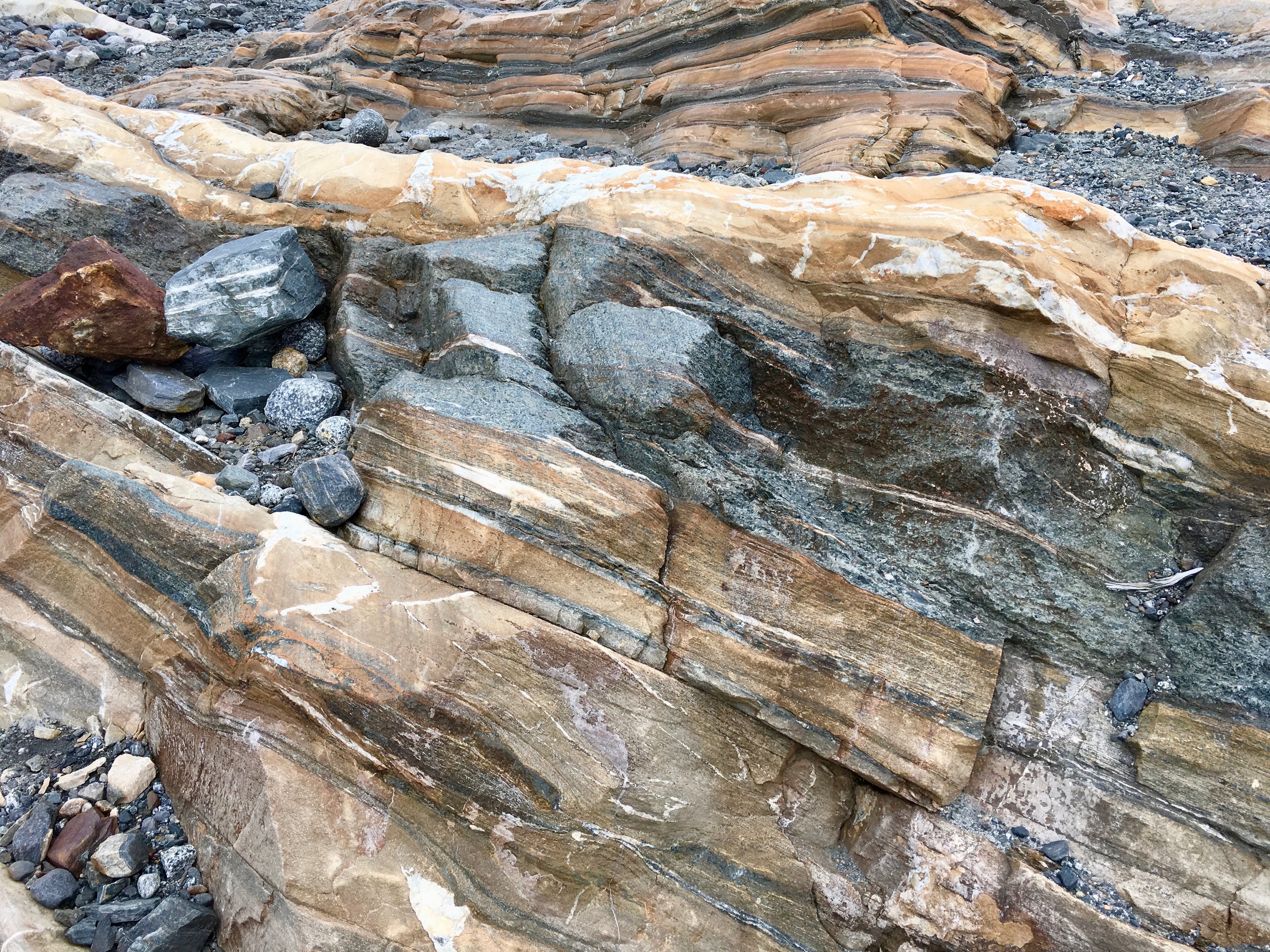
The photo above was taken in Juneau, Alaska near the ice caves. That boulder was a glacier deposit. Notice the beautiful color palette, it has dark greys, blue greys, deep rusts (iron deposits), a myriad of pale gold and beige, as well as white quartz. If these colors were the right palette for one of our clients, we would sample them, and convert them to the right ratios for use on the web and in print materials.
When we are working with a team or a company, all the individuals answers the questionnaire. We want everyone to own the colors and be proud of their brand and logo.