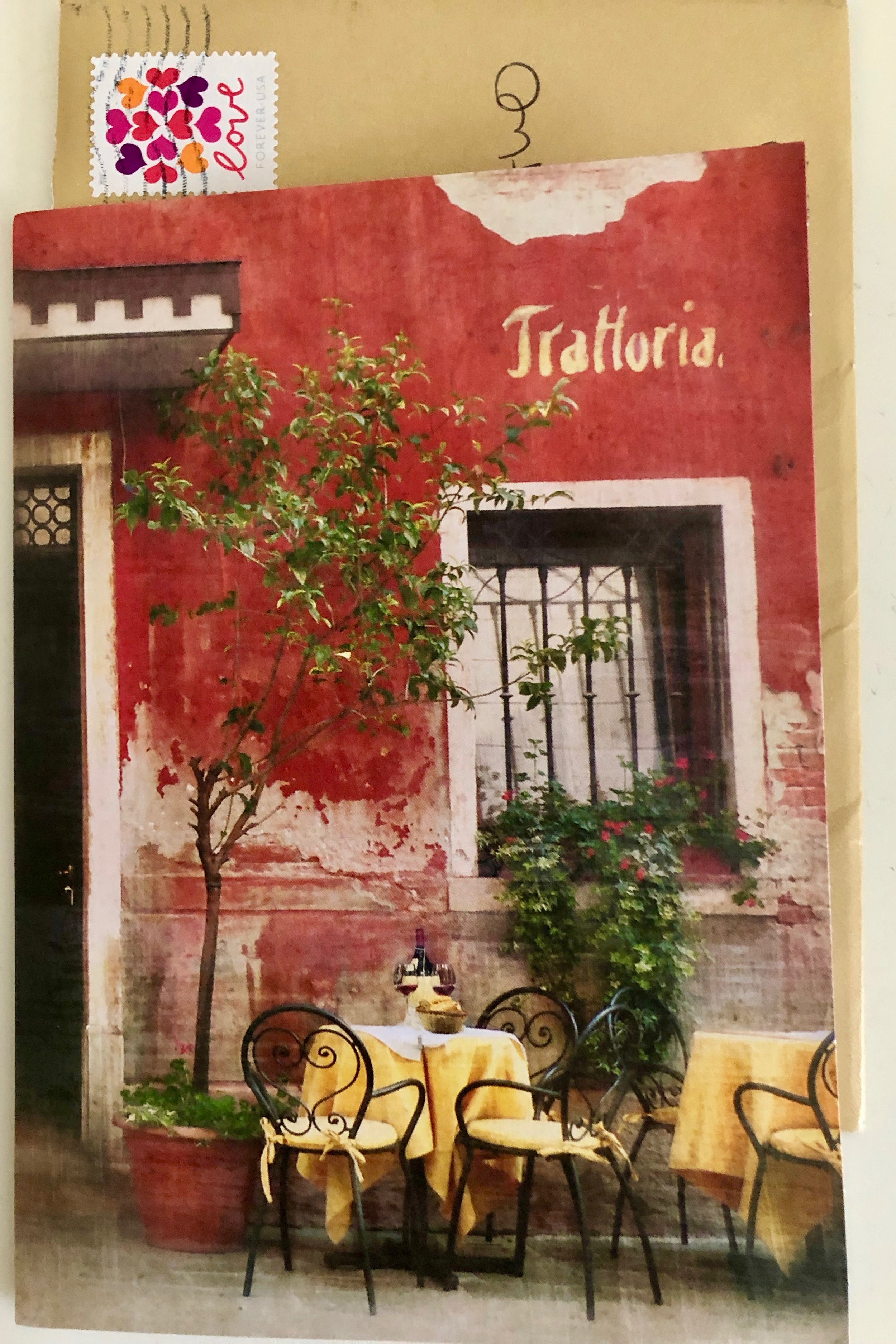
In crafting a brand, we are adamant about creating a great impression to the right audience. A first impression is what captures someones attention when looking to buy or list in real estate or in any other profession. The message has to be clear, easy to understand, and in an nutshell, Telling It Like It Is!
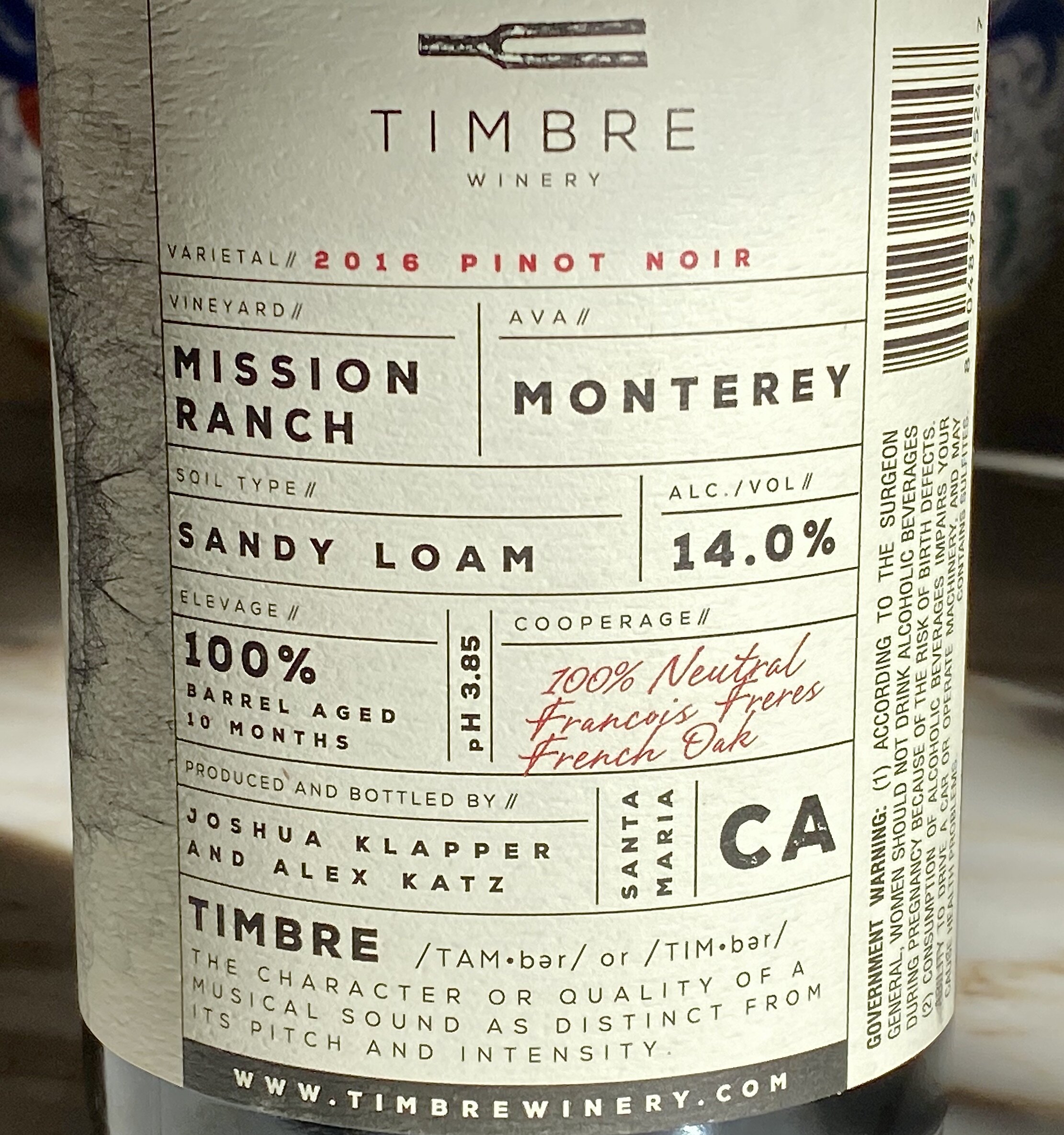
Our recent visit to see our friend Jane, owner of Carpinteria Wines, led us to trying a new Pinot Noir. Pictured above is the back of the label. We both appreciated that it was easy to read, and we could easily find the alcohol content instead of taking a magnifying glass to find it. They also gave credit to the cooperage (i.e) the barrel maker. Plus, the winery took time to explain their brand name, TIMBRE!
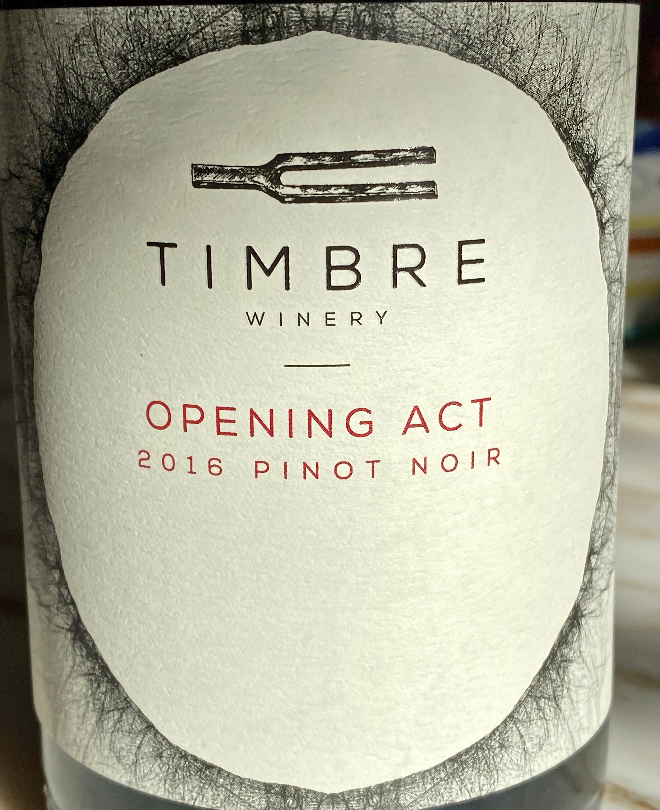
Here is the front label, and we both liked the brand name and the subtitle of Opening Act, for this Pinot Noir! We bought it, enjoyed it, and recommend it.
Here are the winemaker's notes:
"The mix of Pinot Noir clones are co-fermented to create a wine that brims with red roses, strawberry and cranberry, but also offers cola and earthy components. The palate has a gorgeous weight and just a kiss of oak from the handful of once-used French oak barrels we slipped into the blend."
Is Your Real Estate Message Telling It like It Is?