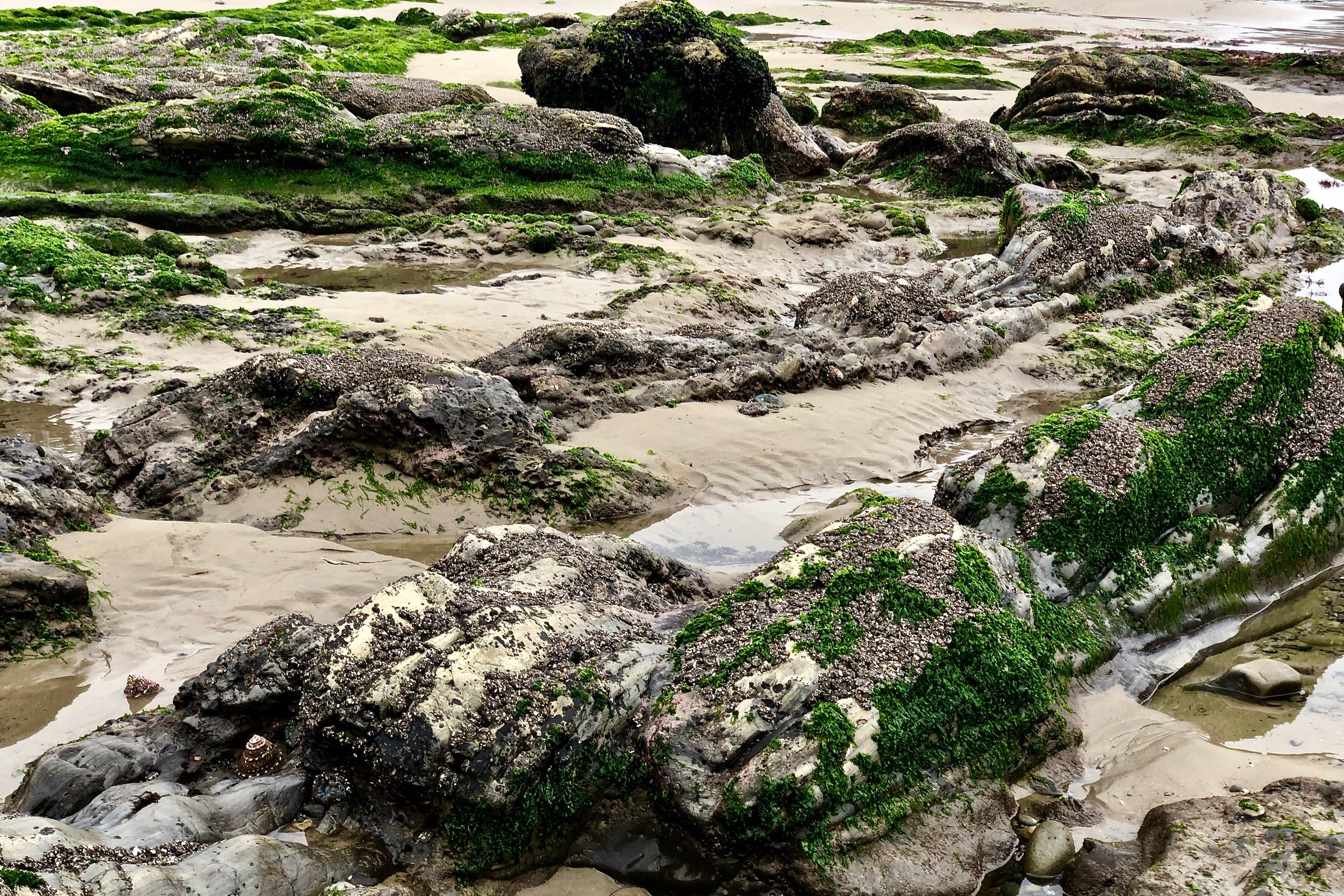
The colors of a brand are part of its identity. It is the first thing, people notice. Colors are impressions and they are associated with feelings, impressions and experiences, that the onlooker identifies with or does not. Pictured above is a scene from Carpinteria State Beach at low tide a week ago. If we were to do a brand for Capinteria real estate, this would be a palette of colors we would draw from if appropriate.
In real estate, brand colors should include and reflect the marketplace of the real estate agent and or company. These colors can be dominant or subtle. It depends on the overall strategy and the personality of the agent and the marketplace. Pictured above are anemones on the reefs which are only visible at low tide. Their color reminds us of the Tiffany blue.

In real estate, brand colors should include and reflect the marketplace of the real estate agent and or company. These colors can be dominant or subtle. It depends on the overall strategy and the personality of the agent and the marketplace. Pictured above are anemones on the reefs which are only visible at low tide. Their color reminds us of the Tiffany blue.

Although we have Pantone color swatches in our arsenal as well as software to help us get the right hues, we find that nature's colors are one of the best sources of inspiration when it comes to getting it right. This is one of the reasons we take so many photos of different flowers, trees, vegetables, landscapes, seascapes when we travel of our client's marketplace. Pictured above is another rich palette of colors to choose from.

Pictured above, that section of orange red is part of a sea star (formerly known as starfish) that has tucked itself in among the mussels and other crustaceans. In our area, we have seen burgundy sea stars, yellow ones and these reddish orange ones.
Whether one uses just one or two colors depends on the overall strategy. For one of swho sells land as his niche, we tested the dirt color and used it as one of the brand color with an accent of orange (his favorite color). We added a hand drawn illustration of the California Oak which is the signature tree on those large ranches, vineyards, and estates he sells throughout the tri-county area.
Using brand colors that reflect the marketplace is another way to communicate your authenticity. Remember colors are a form of perception that people identify with and are attracted to. Do your brand colors reflect your marketplace?