
Script or Cursive fonts are often thought to be fonts that express luxury. However, less that 20% of the premier luxury brands logos have cursive fonts. If they do, they are usually simple, easy to read on a business card, a billboard, or in mobile form.
Recently when we drove by a shopping center monument sign depicted below, both Ron and I read it as "Swille", and we wondered at the choice of the name. The definition of "swill" is a large mouthful of a drink, or kitchen refuse and scraps of waste food mixed with water for feeding pigs.
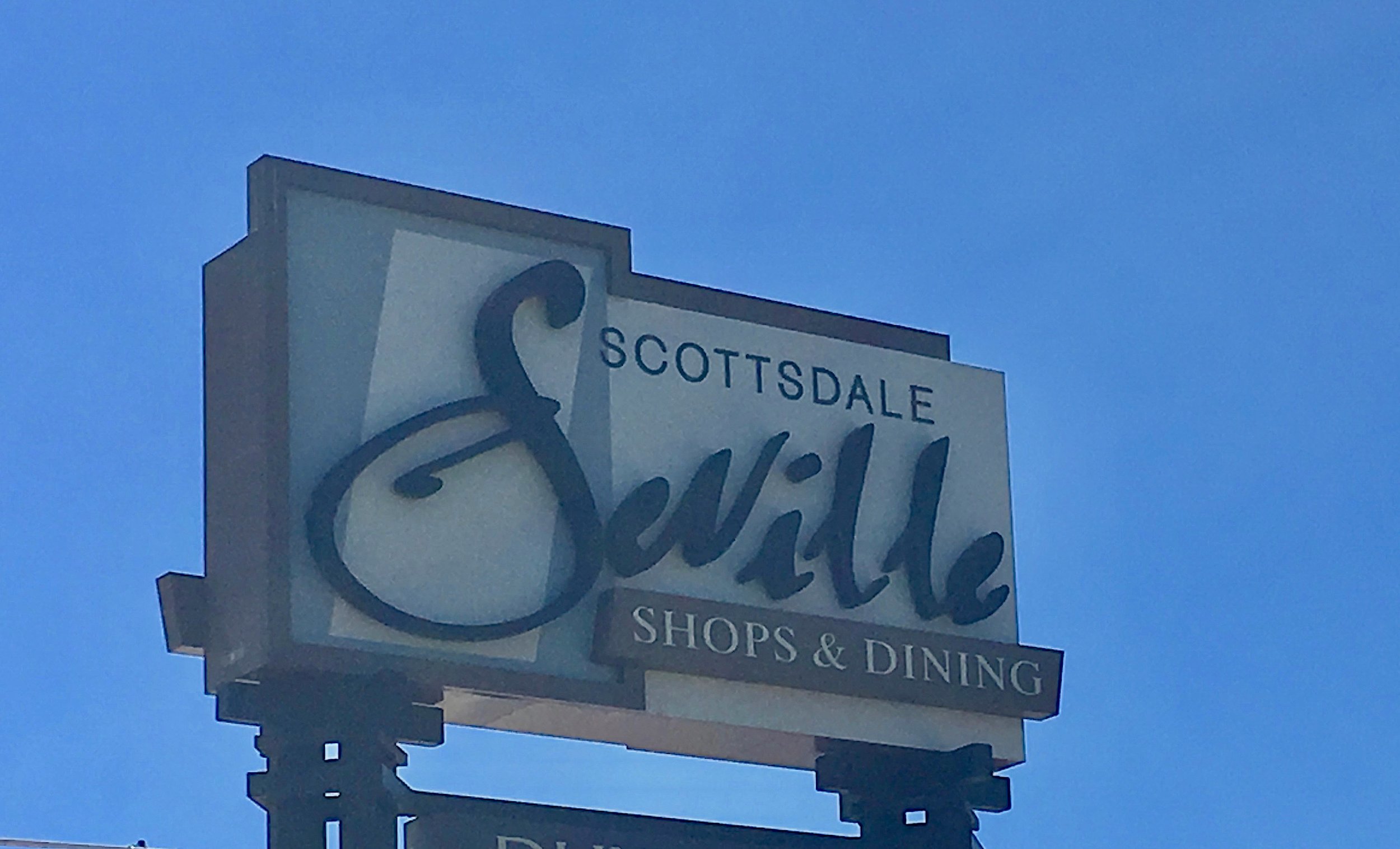
The next day on our lunch break, we pulled in and parked so we could take a closer look. The "ev" of the sign transformed into a "w" in certain light! No doubt this font was chosen with luxury in mind, as there are several high end retailers in this shopping center.
When choosing a font, we pay close attention to every letter of the alphabet (caps and lower case) to make sure it can easily be read on a sign, card, letterhead and all the brand iterations, It also has to be aesthetically pleasing and in harmony with the brand. Character spacing can make or break a brand name in a logo. In this case the spacing was too close between the "e" and the "v".
Written by Ron & Alexandra Seigel-
ABOUT: Napa Consultants, International specializes in the art of local niche marketing in affluent communities and they are the leader in brand strategy for the luxury real estate industry. Working exclusively with entrepreneurs and professionals who are passionate about gaining or sustaining market leadership, they help their clients become the breakaway brand in their marketplace.